"The Cone of Possibility: From a Newspaper Chart to a Mapping Library"
9 min read
A Washington Post El Niño interactive sent me down a rabbit hole. I came out the other side with an honest Monte Carlo fan chart, a from-scratch geographic mapping library, and a working demo app — all value-agnostic, all pure SwiftUI Canvas, no dependencies.
I was reading a Washington Post interactive about how extreme this year’s El Niño could get, and one chart stopped me. It showed the sea-surface-temperature anomaly climbing through the year, and around the forecast it drew a widening band of uncertainty — a cone of possibility. What I liked about it wasn’t that it was pretty. It was that it was honest. The band widened with time because the future genuinely gets less certain the further out you look, and the shape wasn’t a tidy symmetric envelope — it leaned, because the underlying distribution is skewed.
I had a library sitting in my toolbox — BusinessMath, my Swift Monte Carlo engine — that could produce exactly that kind of honest, sampled uncertainty. So I asked a simple question: what do I have, relative to this article? The answer turned into a weekend of building that reached a lot further than I expected.
Honest uncertainty is a rendering problem and a math problem
The article’s cone works because it’s built from a Monte Carlo ensemble: you simulate many trajectories forward in time, then read the percentiles at each step. The band between the 5th and 95th percentile is the 90% interval; it widens because the spread of the trajectories widens.
The tempting shortcut is to draw the band as mean ± 1.96·σ — a symmetric Gaussian interval. It’s one line of code and it’s usually wrong. Real forecasts — temperature anomalies, revenue, project timelines — are skewed. They spike more easily in one direction than the other. If you draw a symmetric band around the mean, you lie about the shape of the risk.
So the first thing I built was a reusable component that does it right: a nested percentile fan (5/25/50/75/95), read from the empirical quantiles of the ensemble, not a Gaussian assumption. It draws the median as a line, the bands as graduated fills, an optional overlay of individual sampled trajectories (the honest complement to the fan — it shows that real paths are wiggly and autocorrelated), and a hover readout that gives you the exact percentiles at any point.
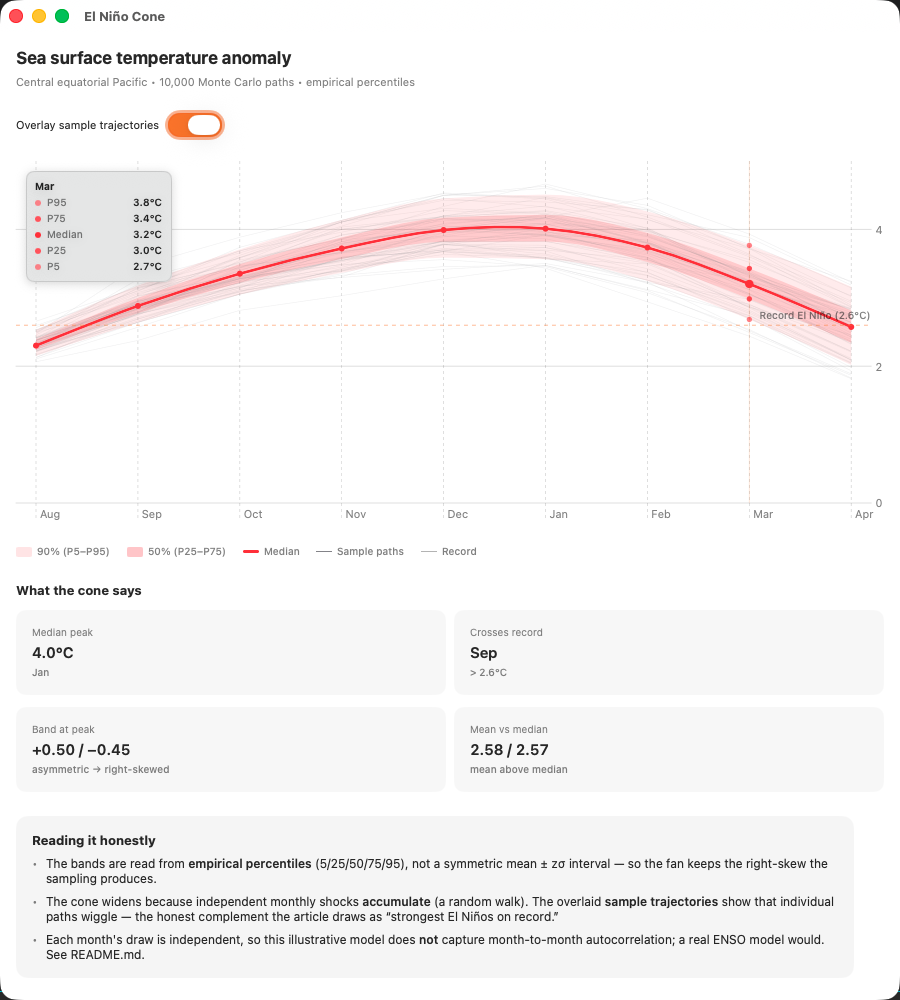
Here’s the honest part I’m proudest of, and it lives in the summary tiles under the chart. One tile reports the mean against the median — and because the sampling is genuinely skewed, the mean sits above the median, the signature of a right-skewed distribution. The band at the peak leans for the same reason: it’s +0.50 up and −0.45 down, not symmetric. The chart isn’t smoothing any of that away. It’s showing you the asymmetry the sampling actually produced. Arguably it’s more faithful than the newspaper’s version, which renders the band as discrete monthly step-boxes; a continuous, skew-preserving fan carries the same honesty at higher resolution.
The article had four visuals, not one
Once the cone worked, I looked at the rest of the article. There were four distinct visuals: the forecast cone, a world choropleth of the probability of extreme heat, an orthographic globe showing the sea-surface-temperature field, and the spaghetti overlay of past strong El Niños. I had reproduced one. The other three were geographic — and I had nothing geographic in the toolbox at all.
That’s usually where a project quietly ends. Rendering scientific fields on a map is exactly the kind of thing you reach for a heavy dependency to do — MapKit, or a 3D engine, or a charting framework that pulls in the world. I didn’t want any of that. BusinessMath’s companion UI packages are deliberately dependency-light, and I wanted whatever I built to match.
So I made a bet: a gridded scalar field over a map projection is just math and 2D drawing. You don’t need MapKit — that’s built for tiles and pins, not continuous fields. And, the insight that made the whole thing feel tractable, you don’t need a 3D engine for the globe. An orthographic projection is a two-dimensional projection: you map latitude and longitude to a disc and cull the far hemisphere. It’s pure Canvas.
I built a new package, BusinessMathMaps, from an empty repository. A few small, composable pieces:
- Projections — pure functions from
(lat, lon)to plane coordinates and back. Equirectangular for flat maps, orthographic for the globe. - A field type that holds arbitrary
Doublevalues on a lat/lon grid. - Colormaps that map any value range to color — sequential, diverging, single-hue.
- Coastlines — Natural Earth’s public-domain land polygons, bundled and parsed.
- A single
Canvasview that colors the field through a projection and overlays the coastlines. One view serves both the flat map and the globe.
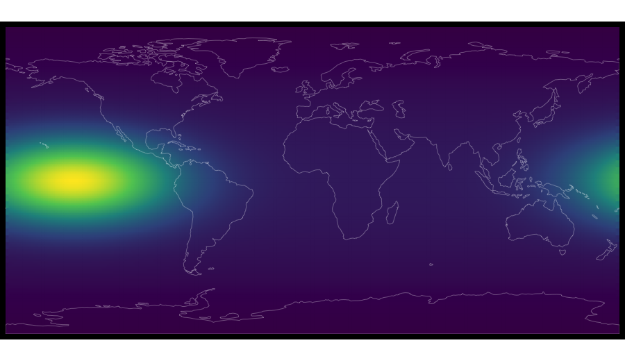
The first render came out looking like a real world map, with the warm anomaly glowing over the equatorial Pacific.
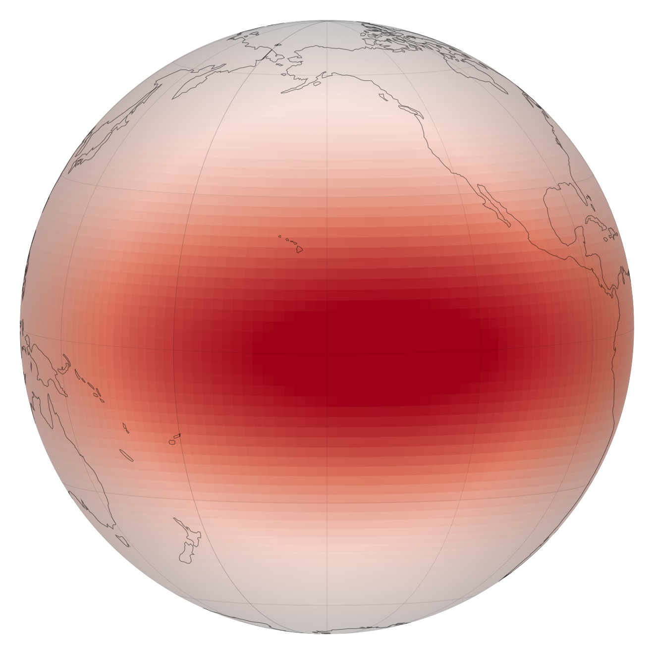
And the globe — the visual I’d assumed would need a 3D scene — rendered as a clean sphere with limb shading, coastlines curving over the surface, no engine underneath it.
Value-agnostic, on purpose
Partway through, I made a design correction that turned out to matter more than any single feature. My first field type was quietly assuming its numbers were probabilities. That’s a trap. The strongest version of this library doesn’t know or care what the numbers mean. “Probability of extreme heat” is just one caller that happens to produce a grid of doubles; so is temperature, so is revenue-by-region, so is population density.
Keeping the field and the colormap decoupled from meaning is what makes the thing reusable across problems. The same renderer that draws a climate field draws a business choropleth — countries colored by an arbitrary metric, with no-data regions left gray.
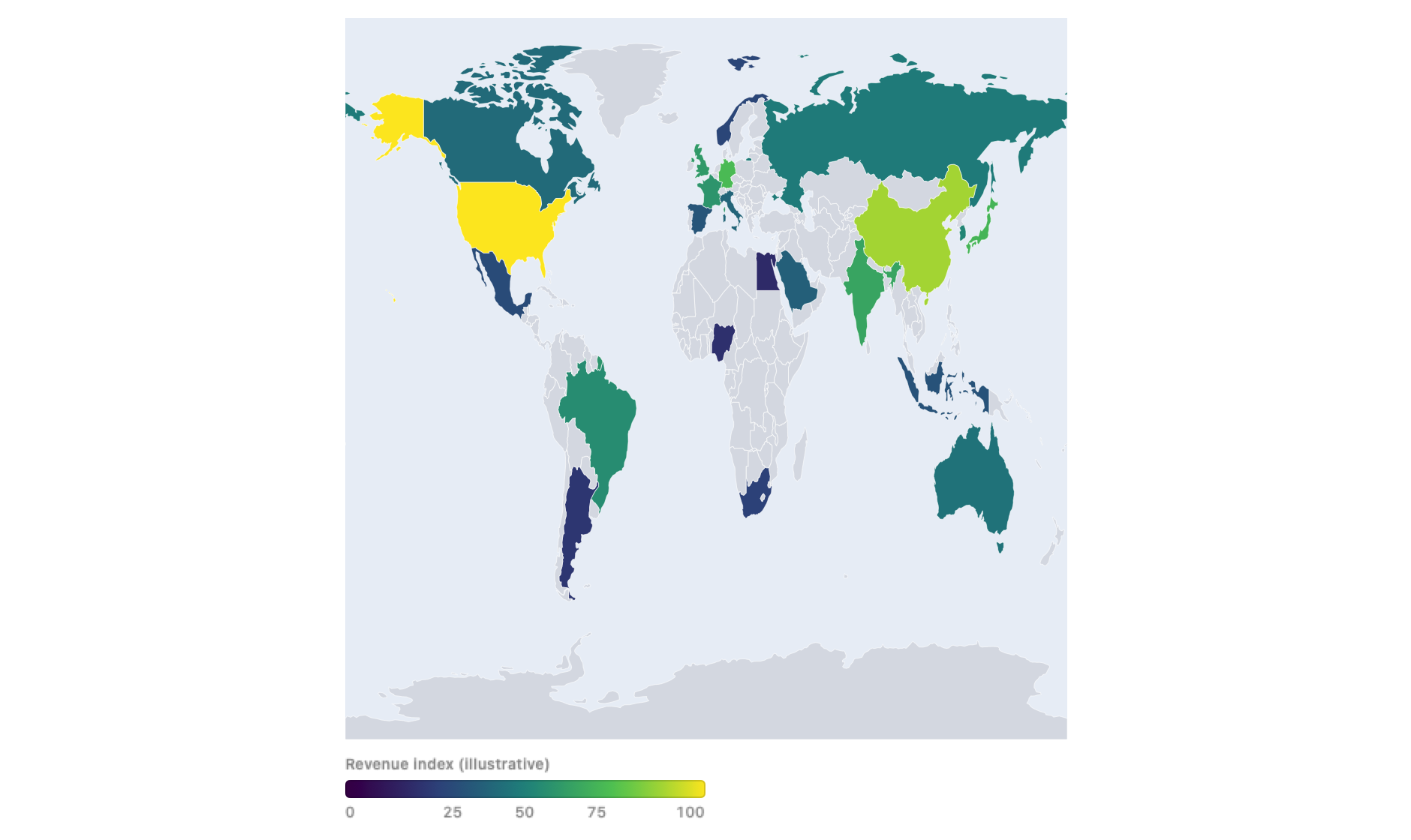
That “value-agnostic” principle is the quiet backbone of the whole library. It’s the difference between a one-off climate visualization and a component you’ll actually reach for again.
The parts where craft shows up
The fun of a project like this is never the happy path. It’s the details you only see once it’s on screen.
The globe developed a pointy pole. Near a pole, all the longitude lines converge, so the grid cells collapse into slivers — and a small anti-aliasing trick I’d used to hide seams between cells was overlapping those slivers into a little spiral pinch that made the sphere look like a teardrop. The fix was two-fold: scale the seam-hiding outset to the cell size so tiny polar cells get almost none, and cap the pole with a single smooth filled region instead of hundreds of converging quads.
Then I added a tilt — the ability to pitch the globe to an oblique, look-toward-the-horizon view, the way Apple Maps does. My first version looked parabolic, like a hill instead of a planet. That one was a real lesson in perspective: the camera was too close, so at a steep tilt you were looking well past the horizon and the near edge flattened into a wide arc. Pulling the camera back — less aggressive perspective — let the tilt read as a rounded sphere again. It’s correct geometry either way; it just needed the camera in a sane place.
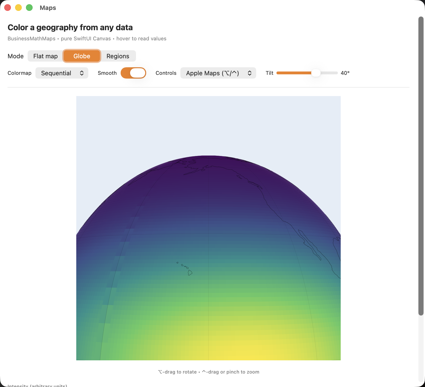
There were more of these than I can list: making the equirectangular projection a true 2:1 Plate Carrée instead of an accidental square that stretched every continent vertically; giving the globe Apple-Maps-style modifier-gated controls (hold a key and drag to rotate, another to zoom, another to tilt) so it lives happily inside a scrolling page; swapping coarse coastlines for finer ones automatically as you zoom in. None of them are hard. All of them are the difference between a demo that looks almost right and one that looks right.
The shape of the stack
What I ended up with is layered cleanly enough that I want to draw it:
BusinessMathdoes the simulation — Monte Carlo ensembles, distributions, empirical percentiles.BusinessMathAdaptersbridges. It takes the simulation output — a grid of per-cell results, or a per-period distribution — and reduces it into exactly the shape a chart or a map wants.BusinessMathUIandBusinessMathMapsrender — the fan chart, the choropleth, the globe.
The El Niño demo runs the whole chain: simulate a forward-looking anomaly, bridge each period’s distribution into percentiles, hand it to the fan chart. Feed a grid of per-cell outcomes through the same bridge and you get a map instead. The pieces compose because none of them reach across the boundary.
Why this is the interesting part
I could have stopped after the fan chart. Reproducing one newspaper chart is a fine afternoon. What I keep coming back to is how far one honest question — “what do I have relative to this?” — carried, when the toolbox underneath was solid and the working style let me keep the whole thing green the entire way.
Every step was tested and committed before the next one started. The maps library went from an empty repository to a tested, documented package with a rotatable, tiltable, hoverable globe — reproducing all four of the article’s visuals — without ever leaving a broken build behind. That’s not a story about a clever algorithm. It’s a story about compounding: a good foundation, a disciplined loop, and a willingness to follow a small spark of curiosity further than seems reasonable.
It started with a cone of possibility in a newspaper. It ended with a globe I can spin with my thumb.
BusinessMath — the simulation engine underneath all of this — is open source on GitHub. The charting, adapter, and mapping packages are companions in the same suite.
Tagged with: project, swift, apple, development, dataviz, monte-carlo, maps